Originals


Edited
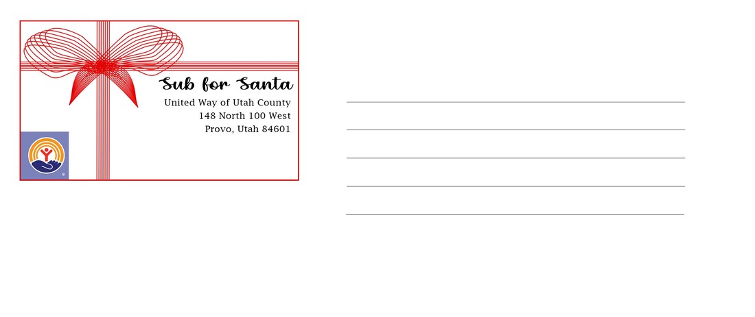


Photo credits: Just Serve
Fonts: dafont.com | Christmas Bell | Lucida Fax
Fonts: dafont.com | Christmas Bell | Lucida Fax
Photoshop Skills:
The readings this week talked about stationery and I love stationery! I thought it would be a really good thing to have in an online portfolio. I know stationery usually includes business cards, letter heads and envelopes so I stuck with those three.
I also decided to put the images as they are so that they are easily readable. If put side by side, they would be too small to see and read properly.
Design Process:
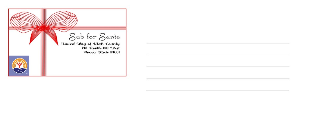
I first started with the business card, it being the smallest. I wanted everything to be formatted and sized the same so it made the most sense to start with the smallest thing. I really enjoyed making designs using the pen tool so I messed around with that first. When I finished with that, it looked like a little bow! So I started thinking about what businesses I could do with that. Christmas is coming up so I immediately thought of the Sub for Santa program.
With the bow up top, I used the pen tool to add lines of ribbon vertical and horizontal. Using the brush tool, I made each of those red, because Christmas! And with it being Sub for Santa, red seemed very fitting for Santa's usual attire.
I looked the program up online and they had their own logo, so I included that on each piece of stationery. I also downloaded some Christmas-y fonts for the text. On the business card, I included the address, phone number and website. Those seemed like pretty crucial things for someone to get a hold of them. Since the bow was on the left side, I aligned the text to the right so the design wasn't too heavy on either side. As for the fonts, I knew I wanted Sub for Santa in some sort of serif font. This one, Santa'sSleighFull, was perfect since it captured the Christmas theme and was simple. I wanted to contrasting fonts so I went with a more curly font, Christmas Bell, for the rest of the text.
Once I had all the elements I wanted on the business card, I copied it and pasted it on the envelope and the letter head. That way it was same all the way across each piece of stationery.
Revision
I changed the fonts. The address and other information was difficult to read as a cursive font, so I changed that to a serif font with the name, "Sub for Santa" in the cursive font. I also realigned everything on the business card and made the sizing of the text fit the importance of the information.
- Pen Tool
- Brush
- Free transform
- Text
- Shape tool
The readings this week talked about stationery and I love stationery! I thought it would be a really good thing to have in an online portfolio. I know stationery usually includes business cards, letter heads and envelopes so I stuck with those three.
I also decided to put the images as they are so that they are easily readable. If put side by side, they would be too small to see and read properly.
Design Process:
I first started with the business card, it being the smallest. I wanted everything to be formatted and sized the same so it made the most sense to start with the smallest thing. I really enjoyed making designs using the pen tool so I messed around with that first. When I finished with that, it looked like a little bow! So I started thinking about what businesses I could do with that. Christmas is coming up so I immediately thought of the Sub for Santa program.
With the bow up top, I used the pen tool to add lines of ribbon vertical and horizontal. Using the brush tool, I made each of those red, because Christmas! And with it being Sub for Santa, red seemed very fitting for Santa's usual attire.
I looked the program up online and they had their own logo, so I included that on each piece of stationery. I also downloaded some Christmas-y fonts for the text. On the business card, I included the address, phone number and website. Those seemed like pretty crucial things for someone to get a hold of them. Since the bow was on the left side, I aligned the text to the right so the design wasn't too heavy on either side. As for the fonts, I knew I wanted Sub for Santa in some sort of serif font. This one, Santa'sSleighFull, was perfect since it captured the Christmas theme and was simple. I wanted to contrasting fonts so I went with a more curly font, Christmas Bell, for the rest of the text.
Once I had all the elements I wanted on the business card, I copied it and pasted it on the envelope and the letter head. That way it was same all the way across each piece of stationery.
Revision
I changed the fonts. The address and other information was difficult to read as a cursive font, so I changed that to a serif font with the name, "Sub for Santa" in the cursive font. I also realigned everything on the business card and made the sizing of the text fit the importance of the information.
