|
|
|
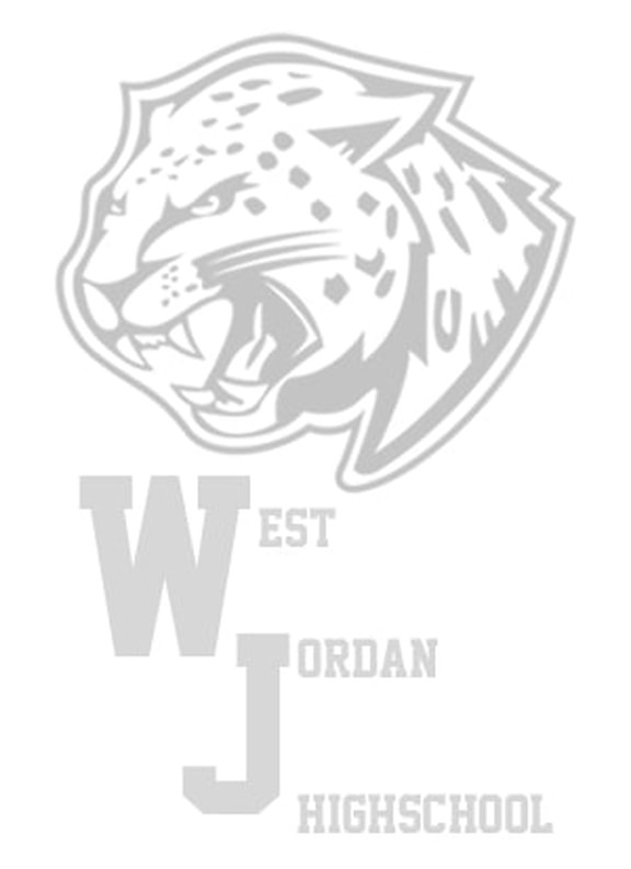
Original
|
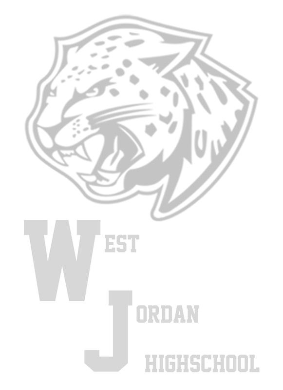
Revised
|
Credits
Picture | WJHS website
Front | dafont.com | Academic M54 by justme54s
Picture | WJHS website
Front | dafont.com | Academic M54 by justme54s
This is a design for a small notepad. I have some connections with West Jordan Highschool so I thought it would be fun to design a notepad for them.
Photoshop Skills:
Thought Process:
I took a graphic design class in high school and we designed our own little notepads. It was a project that I really enjoyed and I saw this as an opportunity to do another one! My mom works at WJHS so I thought it would be neat to design something for her.
Design Process:
I knew I wanted the jaguar and the letters "WJ" to be larger and more prominent on the page. Originally, I had the jaguar much bigger with "WJ" a little smaller in the bottom left corner, but I felt like it was missing something. So I made the jaguar smaller, making sure to keep it centered, and then added the rest of the words you see on the page. I know we've learned about how typical and boring it is to keep everything centered, but I felt like this design called for a centered alignment. The font I used resembles the high school's actual design, along with the way the "WJ" are aligned with each other.
Because it's a notepad, I thought it was best to keep it black and white and change the opacity. That way, it can actually be written on and used for its intended purpose.
Revision:
I moved the last part of "Jordan" down so it matched "West" and I also lined up my text with the edges of the jaguar. I also made the file size a little bit bigger by saving it as 300 ppi instead of 72 ppi.
Photoshop Skills:
- Free Transform
- Change opacity
- Text
Thought Process:
I took a graphic design class in high school and we designed our own little notepads. It was a project that I really enjoyed and I saw this as an opportunity to do another one! My mom works at WJHS so I thought it would be neat to design something for her.
Design Process:
I knew I wanted the jaguar and the letters "WJ" to be larger and more prominent on the page. Originally, I had the jaguar much bigger with "WJ" a little smaller in the bottom left corner, but I felt like it was missing something. So I made the jaguar smaller, making sure to keep it centered, and then added the rest of the words you see on the page. I know we've learned about how typical and boring it is to keep everything centered, but I felt like this design called for a centered alignment. The font I used resembles the high school's actual design, along with the way the "WJ" are aligned with each other.
Because it's a notepad, I thought it was best to keep it black and white and change the opacity. That way, it can actually be written on and used for its intended purpose.
Revision:
I moved the last part of "Jordan" down so it matched "West" and I also lined up my text with the edges of the jaguar. I also made the file size a little bit bigger by saving it as 300 ppi instead of 72 ppi.
