|
|
|
Original
|
Photo Credit: thanksgivingpoint.org
Font: Impact |
Revised
|
Photoshop Skills:
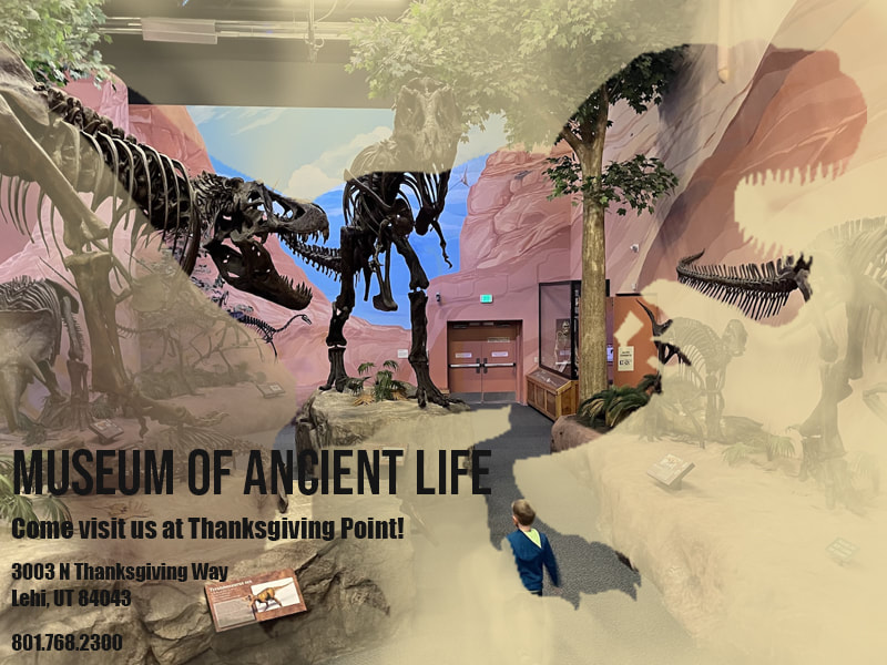
When thinking of what I wanted to do for this portfolio exhibit, my mind immediately went to dinosaurs. I don't know why, but I liked the idea so I stuck with it. What can I do with dinosaurs? Ah! There are dinosaur museums. So this is what I came up with.
Design Process:
I knew I wanted to do something with the clipping mask and having a dinosaur silhouette somewhere in there. At first, I had a picture of another dinosaur in the silhouette, but that looked ridiculous. I thought it would look better if there was a picture of an actual museum in the silhouette, so I switched it out for the one above. After getting the clipping mask situated, all I could see was black with the museum in the dinosaur. That looked stupid. So I replicated the museum picture and used a mask to let it fade in and out behind the silhouette. I made sure to change the opacity in different places to allow the shape of the dinosaur to still show through. And lastly, I added the text in the bottom left corner.
I focused on repetition in this design by using a dinosaur silhouette on top of the dinosaur skeletons in the background. I also stuck with the color theme using light browns and tans. It allows for a better "dinosaur world" feel.
Revision:
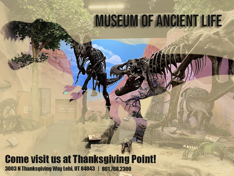
First, I fixed up the dinosaur silhouette so it wasn't pixelated. It's now a little smoother than it was before. I also flipped the background image. This allowed me to put the focus more on the exhibit and less on the exit door and the kid on the bottom. I moved the text around as well. I put the address and phone number on the same line and moved the name of the museum to the top. This helped make the alignment feel more balanced. To make it easier to read and add some life, I added a drop shadow to the museum name. The last thing I did was make the tan layer over top a little smoother.
- Clipping mask
- Brush tool
- Text
- Mask tool
When thinking of what I wanted to do for this portfolio exhibit, my mind immediately went to dinosaurs. I don't know why, but I liked the idea so I stuck with it. What can I do with dinosaurs? Ah! There are dinosaur museums. So this is what I came up with.
Design Process:
I knew I wanted to do something with the clipping mask and having a dinosaur silhouette somewhere in there. At first, I had a picture of another dinosaur in the silhouette, but that looked ridiculous. I thought it would look better if there was a picture of an actual museum in the silhouette, so I switched it out for the one above. After getting the clipping mask situated, all I could see was black with the museum in the dinosaur. That looked stupid. So I replicated the museum picture and used a mask to let it fade in and out behind the silhouette. I made sure to change the opacity in different places to allow the shape of the dinosaur to still show through. And lastly, I added the text in the bottom left corner.
I focused on repetition in this design by using a dinosaur silhouette on top of the dinosaur skeletons in the background. I also stuck with the color theme using light browns and tans. It allows for a better "dinosaur world" feel.
Revision:
First, I fixed up the dinosaur silhouette so it wasn't pixelated. It's now a little smoother than it was before. I also flipped the background image. This allowed me to put the focus more on the exhibit and less on the exit door and the kid on the bottom. I moved the text around as well. I put the address and phone number on the same line and moved the name of the museum to the top. This helped make the alignment feel more balanced. To make it easier to read and add some life, I added a drop shadow to the museum name. The last thing I did was make the tan layer over top a little smoother.
