Original
|
Edited
|
Credits: Font | Poetsen One
Video | Starz Unlimited
Video | Starz Unlimited
Photoshop Skills:
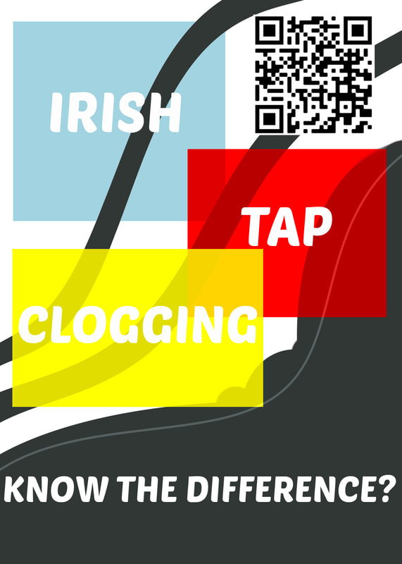
My first thought when we were asked to make an infographic was to tell the different between certain kinds of dance. I am a clogger. When I tell people this, they say "Oh yeah, it's like tap!" or "Is that like Irish dance?" But they're three different things. So I thought I'd create this simple graphic to lead people to know the difference between the three!
Design Process:
I started with a plain background and added mask to fill in just a part of it, the dark part on the bottom. Then I added the three colored boxes with text in them, to show the three different types of dance. I also created a QR code with a link to a video showing the differences between the types of dance. I felt the design needed more, so using the shape tool, I added some long rectangles and warped them so that they followed the curve of my initial background design. These help guide the eye through the graphic and add some movement so it isn't stagnant. For color, I thought it would be fun to use the three primary colors since they're so bright.
This design would be put in a dance studio or someplace where people would be interested in the different types of dance. It's not something to just be put on the street or whatever.
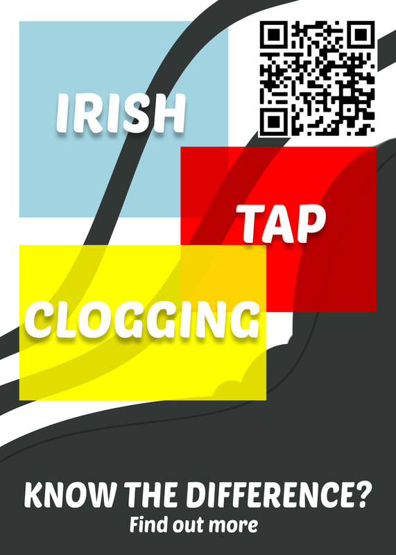
Revision:
I put some guidelines on and noticed that nothing was aligned the way it should be. So using those guides, I realigned the colored boxes, QR code and text. I also added drop shadows to the types of dance so that they are more readable, especially on the yellow box.
I kept alignment in mind this time!
- Shape tool
- Free transform
- Warp
- Text
- Blend modes
- Quick mask
My first thought when we were asked to make an infographic was to tell the different between certain kinds of dance. I am a clogger. When I tell people this, they say "Oh yeah, it's like tap!" or "Is that like Irish dance?" But they're three different things. So I thought I'd create this simple graphic to lead people to know the difference between the three!
Design Process:
I started with a plain background and added mask to fill in just a part of it, the dark part on the bottom. Then I added the three colored boxes with text in them, to show the three different types of dance. I also created a QR code with a link to a video showing the differences between the types of dance. I felt the design needed more, so using the shape tool, I added some long rectangles and warped them so that they followed the curve of my initial background design. These help guide the eye through the graphic and add some movement so it isn't stagnant. For color, I thought it would be fun to use the three primary colors since they're so bright.
This design would be put in a dance studio or someplace where people would be interested in the different types of dance. It's not something to just be put on the street or whatever.
Revision:
I put some guidelines on and noticed that nothing was aligned the way it should be. So using those guides, I realigned the colored boxes, QR code and text. I also added drop shadows to the types of dance so that they are more readable, especially on the yellow box.
I kept alignment in mind this time!
