|
Original
|
Revised
|
Photo Credit: Myself, Emily Maddocks, Sarah Duggins
Fonts: Caligna DEMO | Segoe Script
Fonts: Caligna DEMO | Segoe Script
Photoshop Skills:
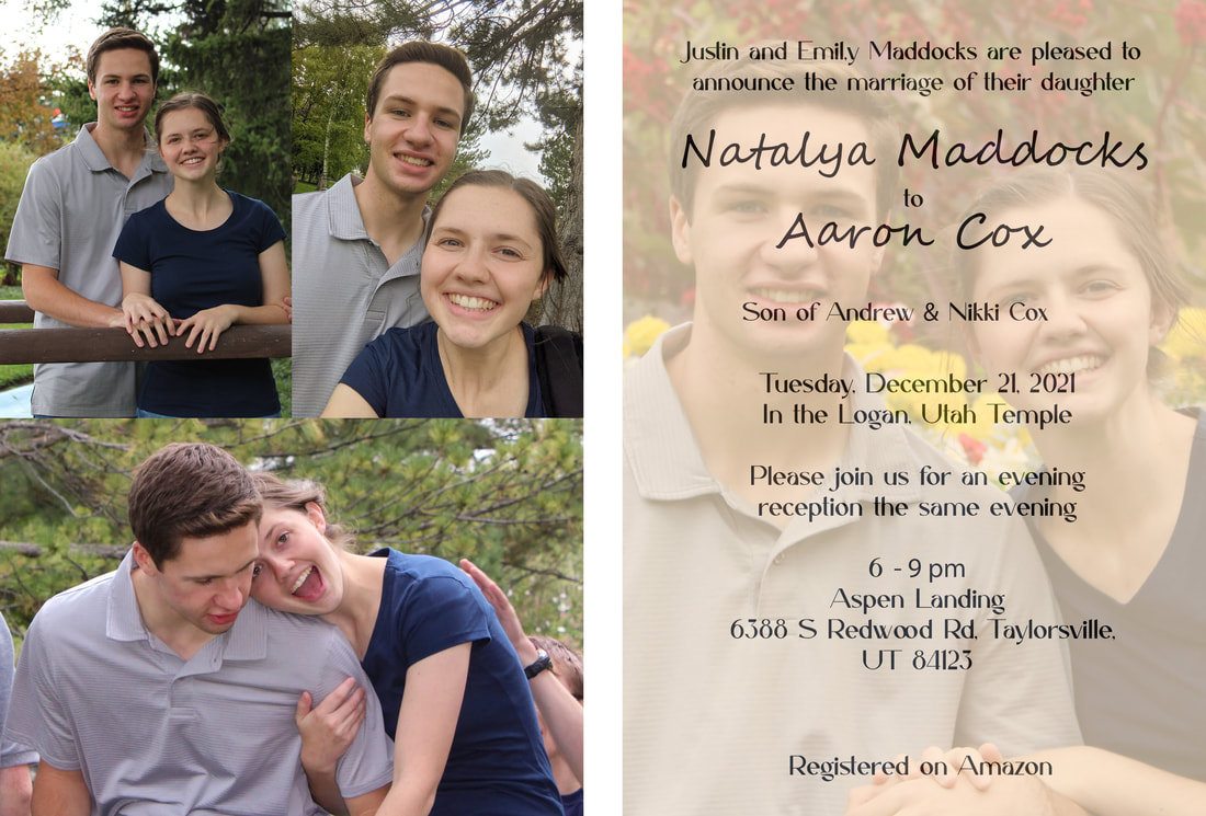
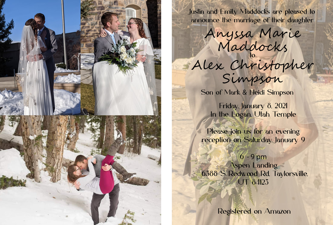
One of our assignments was to make a reusable template, so I went with a wedding announcement.
Design Process:
I started by making two artboards, one for the front of the announcement and one for the back. I wanted the front to have all the information needed for a wedding and reception, so I added the appropriate text. I also added one empty frame to add a picture on the front. I made sure the change the blend mode and the opacity so the text was still readable. I then added three frames to the back side for three other pictures. It was a fairly simple design!
For color, I kept the same palette across for each announcement. The first being more neutral with brown and the second with more whites and greys. Alignment helped me keep each line of text where it needed to be.
Revision
For the first announcement, I changed the pictures to the actual engagement photos instead of some random selfies we'd taken. Those look better anyway since they were done by a more experienced photographer and edited. That also changed the hue of the announcement which helped to make the text more readable.
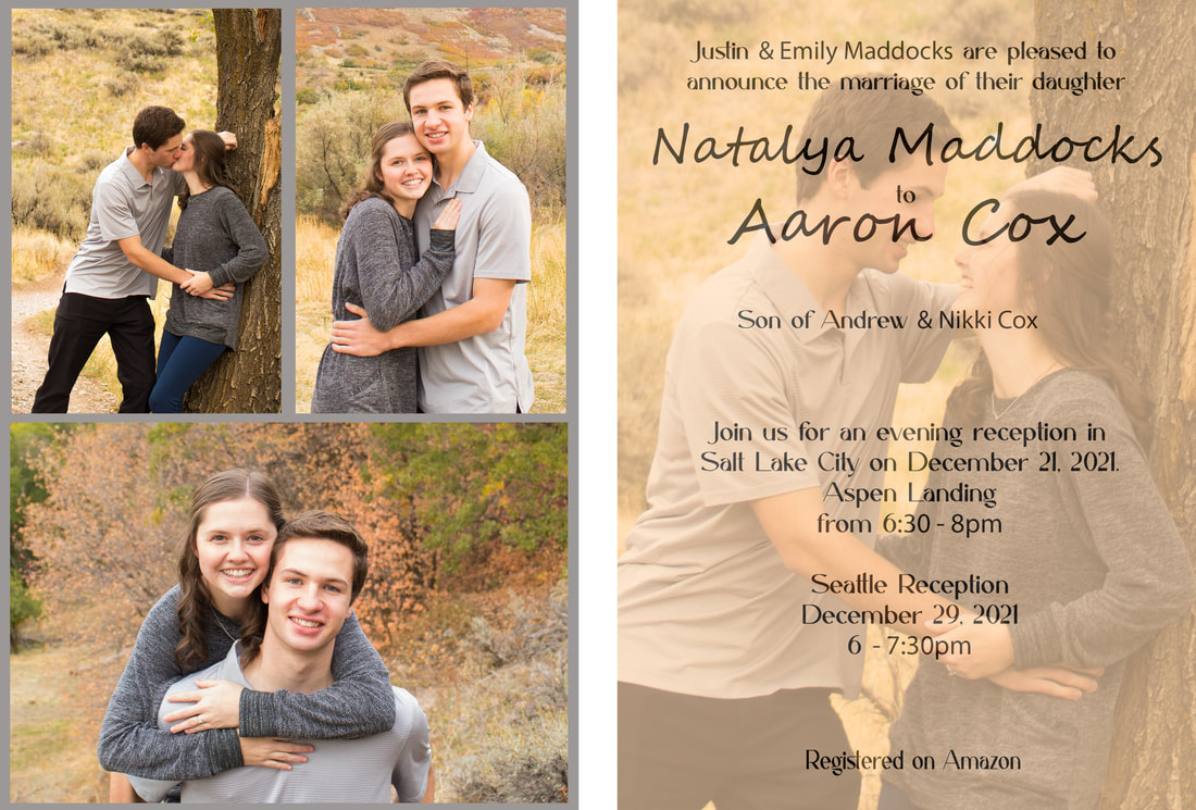
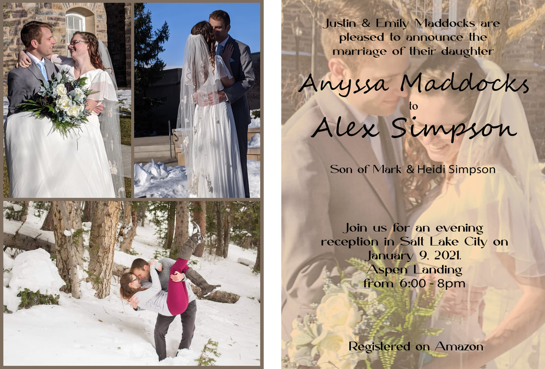
For both announcements, I added borders around the pictures for the back of the announcement. That helps it look more professional and breaks up all the motion of the pictures. I also eliminated some of the text so it was less crowded and more pleasing to the eye. Also for both, I added guidelines to make sure everything was aligned properly and that the borders were even.
For the second one, I rearranged the pictures to help eliminate a flag pole in the background. No one wants flag poles on their wedding announcements.
- Frame tool
- Text tool
- Change opacity
One of our assignments was to make a reusable template, so I went with a wedding announcement.
Design Process:
I started by making two artboards, one for the front of the announcement and one for the back. I wanted the front to have all the information needed for a wedding and reception, so I added the appropriate text. I also added one empty frame to add a picture on the front. I made sure the change the blend mode and the opacity so the text was still readable. I then added three frames to the back side for three other pictures. It was a fairly simple design!
For color, I kept the same palette across for each announcement. The first being more neutral with brown and the second with more whites and greys. Alignment helped me keep each line of text where it needed to be.
Revision
For the first announcement, I changed the pictures to the actual engagement photos instead of some random selfies we'd taken. Those look better anyway since they were done by a more experienced photographer and edited. That also changed the hue of the announcement which helped to make the text more readable.
For both announcements, I added borders around the pictures for the back of the announcement. That helps it look more professional and breaks up all the motion of the pictures. I also eliminated some of the text so it was less crowded and more pleasing to the eye. Also for both, I added guidelines to make sure everything was aligned properly and that the borders were even.
For the second one, I rearranged the pictures to help eliminate a flag pole in the background. No one wants flag poles on their wedding announcements.
