|
|
|
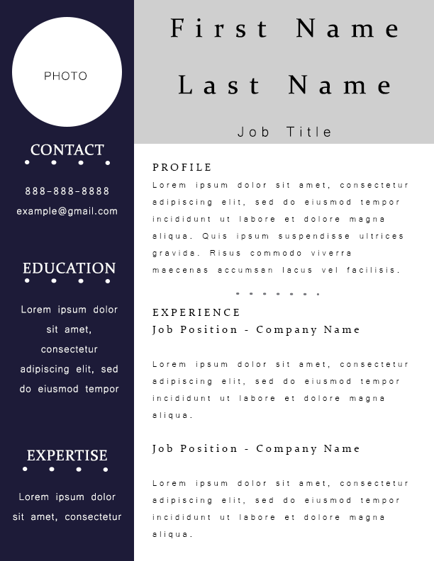
Original
|
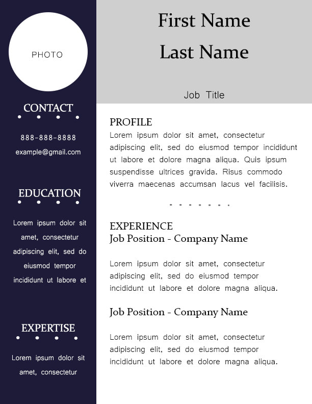
Revised
|
Photoshop Skills:
I love how sleek resumes always look so I just thought it would be fun to design my own!
Design Process:
I wasn't entirely sure what a "nice" resume looked like, so I looked up some pictures of resume templates and based my design off of those. I started with the colored boxes on the left and top then added the little circle for a photo. After that, I added everything in the left column, then everything in the top box, and then the profile and experience sections. I felt like it was lacking a little bit with the same font everywhere, so I played around with a serif and san serif font. I also added the dotted line to give it a little more contrast.
Revision:
When I designed this originally, I had increased the tracking where the name goes. I did this because I wanted to see what it would look like with a name filling the box. So just to revise this and make it more workable, I reset the tracking to zero.
- Lots of text boxes
- Shape tool
- Set the tracking and leading in the text
I love how sleek resumes always look so I just thought it would be fun to design my own!
Design Process:
I wasn't entirely sure what a "nice" resume looked like, so I looked up some pictures of resume templates and based my design off of those. I started with the colored boxes on the left and top then added the little circle for a photo. After that, I added everything in the left column, then everything in the top box, and then the profile and experience sections. I felt like it was lacking a little bit with the same font everywhere, so I played around with a serif and san serif font. I also added the dotted line to give it a little more contrast.
Revision:
When I designed this originally, I had increased the tracking where the name goes. I did this because I wanted to see what it would look like with a name filling the box. So just to revise this and make it more workable, I reset the tracking to zero.
