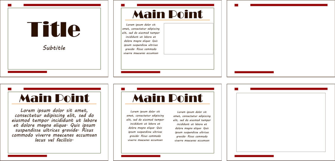
Original
Edited
Credits
Fonts: Broadway | MV Boli
Fonts: Broadway | MV Boli
Photoshop Skills:
I thought it would be fun to design an autumn themed PowerPoint collection. Obviously it would be used in creating presentations!
I have six different slides: A title page, a slide with mostly body text, one with split text, a slide with text on one side and a picture on the other, a blank slide, and one slide with just a picture.
Design Process:
I started with alignment in mind. I set up some grid lines so I would have equal borders. PowerPoint layouts are usually pretty precise. After getting my grid set up, I added the red box borders, but I felt like that wasn't quite enough so I added a dark green full border inside the red boxes. This helped condense the text that I added later so it didn't look like it was floating around.
As for font, I wanted to pick one bold font and one script font. Those compliment each other pretty well and it added some contrast to my design.
My colors revolved around autumn colors. I started making my own swatch so I could use the same colors and make sure they worked well together. I used the dark red for the boxes, orange for my underline, dark green for the border and a dark brown for the text.
For the blank slide and picture slide, I decided not to put the dark green border. Pictures provide their own border so I didn't want that to be overkill, and blank slides are meant to be blank...so I just left the red boxes to keep the theme up.
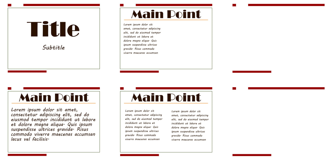
Revision
For this revision, I made all the text aligned to the left. That gives it a much more professional look than leaving it center-aligned.
The types of slides are from left to right: Title slide, text with picture, blank slide, just text, two columns, picture slide.
- Shape tool
- Color swatches
- Type tool
- Frame tool
- Artboards
I thought it would be fun to design an autumn themed PowerPoint collection. Obviously it would be used in creating presentations!
I have six different slides: A title page, a slide with mostly body text, one with split text, a slide with text on one side and a picture on the other, a blank slide, and one slide with just a picture.
Design Process:
I started with alignment in mind. I set up some grid lines so I would have equal borders. PowerPoint layouts are usually pretty precise. After getting my grid set up, I added the red box borders, but I felt like that wasn't quite enough so I added a dark green full border inside the red boxes. This helped condense the text that I added later so it didn't look like it was floating around.
As for font, I wanted to pick one bold font and one script font. Those compliment each other pretty well and it added some contrast to my design.
My colors revolved around autumn colors. I started making my own swatch so I could use the same colors and make sure they worked well together. I used the dark red for the boxes, orange for my underline, dark green for the border and a dark brown for the text.
For the blank slide and picture slide, I decided not to put the dark green border. Pictures provide their own border so I didn't want that to be overkill, and blank slides are meant to be blank...so I just left the red boxes to keep the theme up.
Revision
For this revision, I made all the text aligned to the left. That gives it a much more professional look than leaving it center-aligned.
The types of slides are from left to right: Title slide, text with picture, blank slide, just text, two columns, picture slide.
