|
Inside of Brochure
|
Outside of Brochure
|
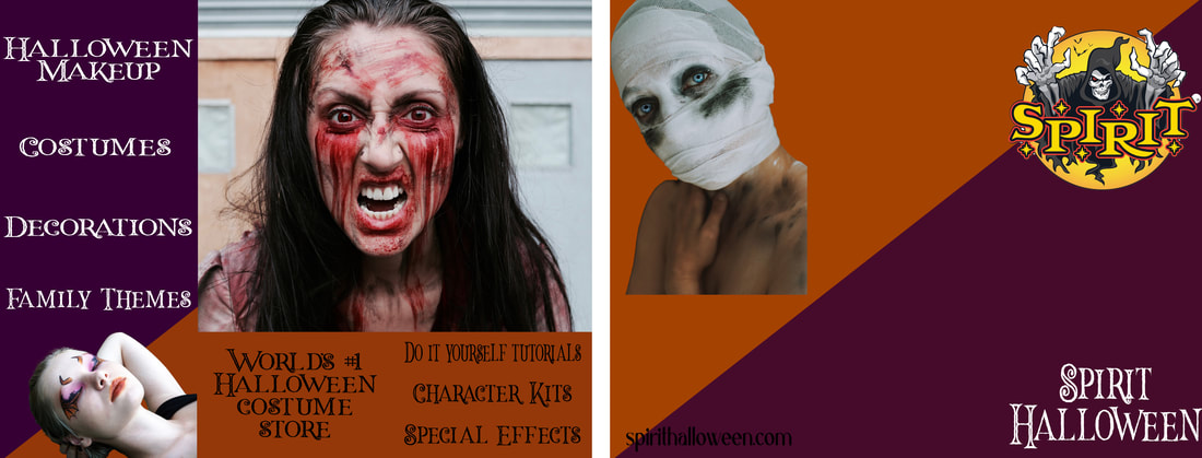
Original
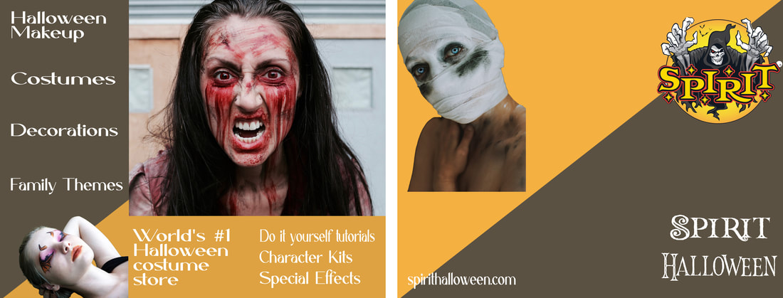
Edited
Photo Credits: Spirit Halloween | Pixabay
Font: Halloween Inline | Caligna DEMO | dafont.com
Font: Halloween Inline | Caligna DEMO | dafont.com
Photoshop Skills:
I knew I wanted to make a brochure with pictures of Halloween makeup, so I thought about it for a minute. My mind wandered to Spirit Halloween, a popular costume store. So I decided to make a brochure for them! This would be in their store or advertised in other stores and sent out in the mail.
Design Process:
I started by making two artboards, one for the outside of the brochure and one for the inside. I then placed the various images where I wanted them and made sure to line them up with the folds. I added the Spirit Halloween logo and name where the front of the brochure will be. I noticed that with the background white, it was a little boring, especially for a Halloween store. So I pulled the purple from the logo and added orange, since those two compliment each other and represent Halloween. I checked out their website and pulled some of their text from there while keeping all the alignments centered and letting them fill each page.
I pulled each image from its background except the middle one. I wanted to show that people at home can do their own makeup, so I thought that by leaving the background, it would give the impression that her makeup wasn't done in a studio.
Revision
Suggestions were made to use the actual colors from the logo, so I pulled out the yellow and grey and thought that looked much better. The colors are less loud and I think it looks more professional now. I also added more guidelines so my borders were equal. I made the text was in the borders I added. I also noticed some of my masks on my pictures weren't quite perfect so I fixed those.
I also changed the font on most of the text so it wasn't so decorative. The san serif font is more readable and looks neater.
- Mask
- Shape tool
- Type tool
- Brush tool
- Marquee tool
- Fill background
- Inverse
I knew I wanted to make a brochure with pictures of Halloween makeup, so I thought about it for a minute. My mind wandered to Spirit Halloween, a popular costume store. So I decided to make a brochure for them! This would be in their store or advertised in other stores and sent out in the mail.
Design Process:
I started by making two artboards, one for the outside of the brochure and one for the inside. I then placed the various images where I wanted them and made sure to line them up with the folds. I added the Spirit Halloween logo and name where the front of the brochure will be. I noticed that with the background white, it was a little boring, especially for a Halloween store. So I pulled the purple from the logo and added orange, since those two compliment each other and represent Halloween. I checked out their website and pulled some of their text from there while keeping all the alignments centered and letting them fill each page.
I pulled each image from its background except the middle one. I wanted to show that people at home can do their own makeup, so I thought that by leaving the background, it would give the impression that her makeup wasn't done in a studio.
Revision
Suggestions were made to use the actual colors from the logo, so I pulled out the yellow and grey and thought that looked much better. The colors are less loud and I think it looks more professional now. I also added more guidelines so my borders were equal. I made the text was in the borders I added. I also noticed some of my masks on my pictures weren't quite perfect so I fixed those.
I also changed the font on most of the text so it wasn't so decorative. The san serif font is more readable and looks neater.
